


InvestNow Redesign:
Reduced time to first investment by 70% and transformed a leaky onboarding into a conversion engine.
InvestNow Redesign:
Reduced time to first investment by 70% and transformed a leaky onboarding into a conversion engine.
Project
Project
InvestNow Redesign
InvestNow
Redesign
Timeline
Timeline
20 months
20 months
Year
Year
2024 - 2026
2024 - 2026
As the Senior Product Designer at United Capital, I led the InvestNow redesign end-to-end owning the design process from audit through to final delivery.
As the Senior Product Designer at United Capital, I led the InvestNow redesign end-to-end owning the design process from audit through to final delivery.
{1} Challenge & Goals
{1} Challenge & Goals
United Capital's InvestNow had a real problem. The app was good at what it did, but users were giving up before they ever got to experience it. Between the long forms, document uploads, and account creation steps, most people tapped out before they even reached the dashboard. All that effort to acquire a user, gone before a single investment was made.
The brief was clear but tricky: make the app faster and more intuitive, without cutting corners on SEC compliance. Those two goals don't naturally get along.
That tension was the heart of the design challenge

Registered users
Registered
users
215k+
215k+
Onboarding drop-off rate
(before redesign)
Onboarding drop-off rate
(before redesign)
57%
57%
Increase in retention
(post-launch)
Increase in retention
(post-launch)
94%
94%
PROBLEMS
PROBLEMS
{2} Problems
Business Problems
Business Problems
Users were abandoning the onboarding process out of frustration. The volume of forms and uploads required before reaching the dashboard was exhausting, and most people simply gave up halfway through.
Stock trading, one of the app's biggest selling points, lived on an entirely separate platform called Folio, meaning users who wanted to trade had to start all over again somewhere else.
Design Problems
Design Problems
The app was asking for everything upfront and giving nothing in return until users had jumped through every hoop. No value, no motivation to continue.
The experience felt like a compliance checklist, not a product people wanted to use.
The app was asking for everything upfront and giving nothing in return until users had jumped through every hoop. No value, no motivation to continue.
The experience felt like a compliance checklist, not a product people wanted to use.

GOALS
GOALS
{3} Goals
{3} Goals
The primary goal was to get users to their first investment faster, and stop losing them to a process that was never designed with them in mind.
While the secondary goal was to bring stock trading into the app natively and make buying investment products feel effortless, all while keeping the SEC happy.


LESSONS
LESSONS
{7} Key Lessons
{7} Key Lessons
What Worked
What Worked
Reframing SEC compliance as something that happens gradually, in context, rather than all at once at the door, was the move that made everything else possible. Compliance and good UX are not opposites. You just have to be creative about how you sequence them.
The biggest wins here were not visual. They came from rethinking how the whole experience was structured. No interface polish would have fixed a fundamentally broken flow.
What I'd Do Differently
What I'd Do Differently
I would have pushed to get drop-off data at every step of the old onboarding before starting design because having those numbers early would have made prioritization much sharper and the business case for each decision much harder to argue with.
I would have pushed to get drop-off data at every step of the old onboarding before starting design because having those numbers early would have made prioritization much sharper and the business case for each decision much harder to argue with.
IMPACT
IMPACT
{6} Impact
{6} Impact
Over 60% reduction in time from signup to first investment.
User retention improved significantly as the drop-off that defined the old onboarding became a non-issue.
Stock trading moved fully in-house with no external redirects. Investment product onboarding went from a drawn-out process to something that takes less than a minute.
The redesign didn’t just make the app look better. It made it work for the people using it.
The redesign didn’t just make the app look better. It made it work for the people using it.
{ii} Stock Trading: From External Widget to Native Feature
{ii} Stock Trading: From External Widget to Native Feature
The problem
The problem
Buying stocks meant leaving InvestNow, signing up on Folio, and starting a whole new onboarding process on a different platform.
Buying stocks meant leaving InvestNow, signing up on Folio, and starting a whole new onboarding process on a different platform.
What I did
What I did
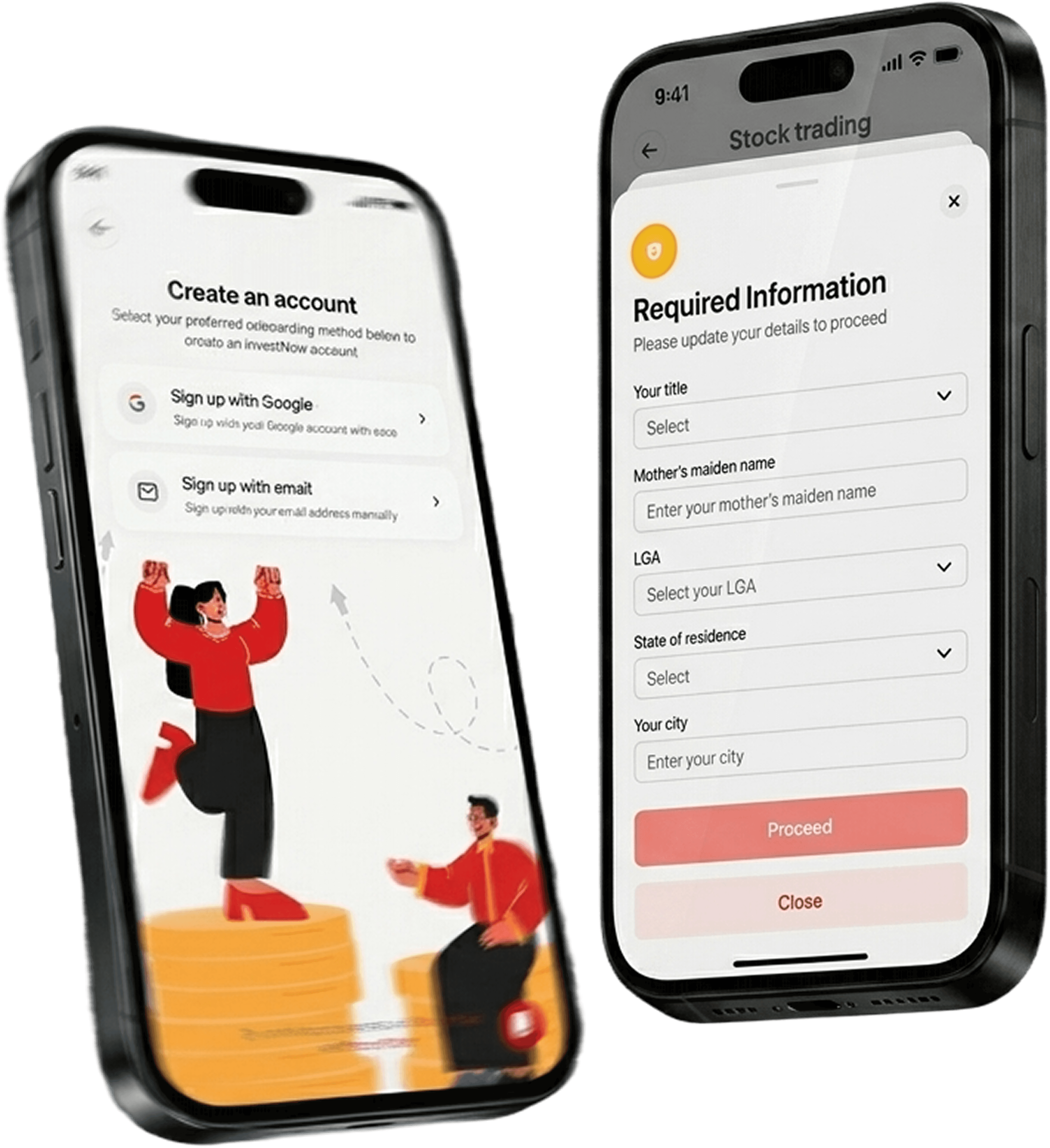
I designed a native stock trading experience built directly into InvestNow. Users can now buy and sell stocks without leaving the app. Opening a securities account went from a multi-step external process to a single simple form, right inside InvestNow.
I designed a native stock trading experience built directly into InvestNow. Users can now buy and sell stocks without leaving the app. Opening a securities account went from a multi-step external process to a single simple form, right inside InvestNow.
The result
The result
No more redirects. No more duplicate onboarding. Stock trading finally felt like part of the product it always should have been.
No more redirects. No more duplicate onboarding. Stock trading finally felt like part of the product it always should have been.

{iii} Investment Product Purchase: KYC-Powered Auto-Fill
{iii} Investment Product Purchase: KYC-Powered Auto-Fill

The problem
The problem
Every investment product required its own separate account, meaning users had to fill in the same information over and over again.
Every investment product required its own separate account, meaning users had to fill in the same information over and over again.
What I did
What I did
I introduced a KYC data bridge. Once a user completes their KYC, that information automatically pre-populates account creation for any investment product they want to access. What used to take multiple steps now takes under a minute.
I introduced a KYC data bridge. Once a user completes their KYC, that information automatically pre-populates account creation for any investment product they want to access. What used to take multiple steps now takes under a minute.
The result
The result
Repeat data entry eliminated. Users go from wanting a product to having it open almost instantly.
Repeat data entry eliminated. Users go from wanting a product to having it open almost instantly.
SOLUTIONS
SOLUTIONS
{5} Solutions
{5} Solutions
{i} Onboarding Redesign: From Forms Wall to Progressive Trust
{i} Onboarding Redesign: From Forms Wall to Progressive Trust
The problem
The problem
Users had to complete everything before they could do anything.
Users had to complete everything before they could do anything.
What I did
What I did
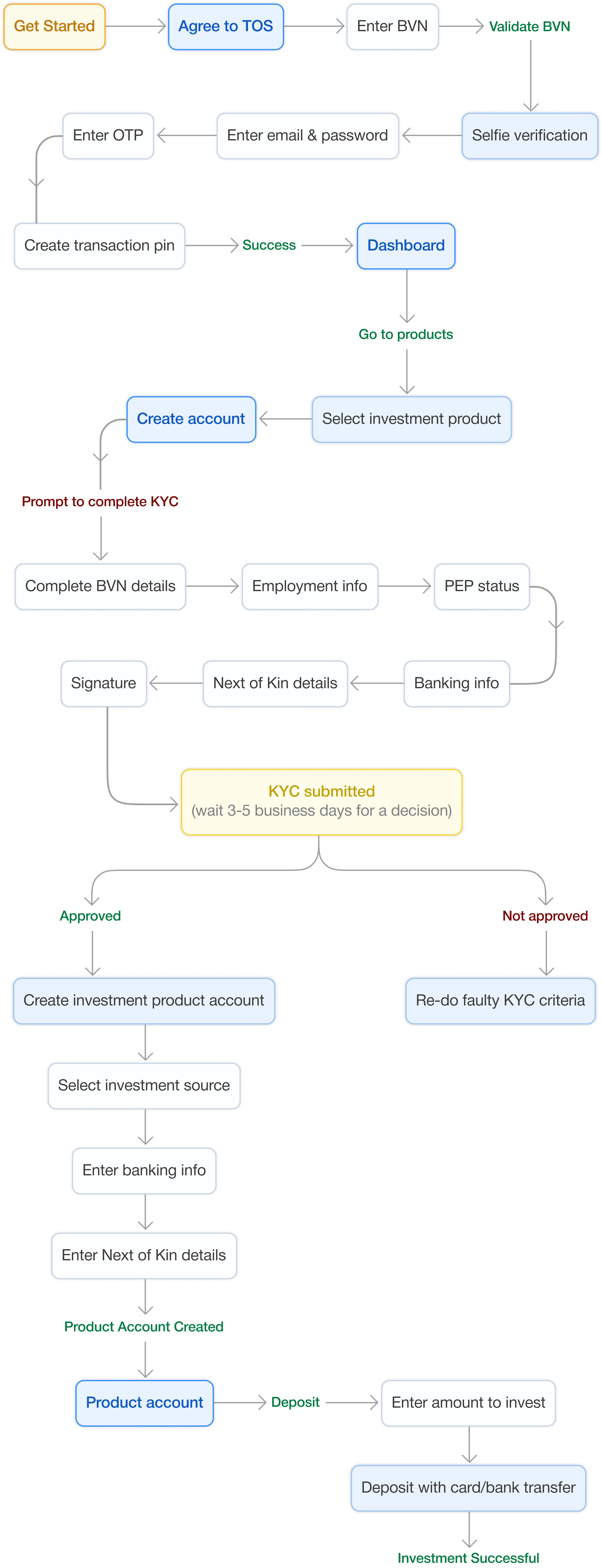
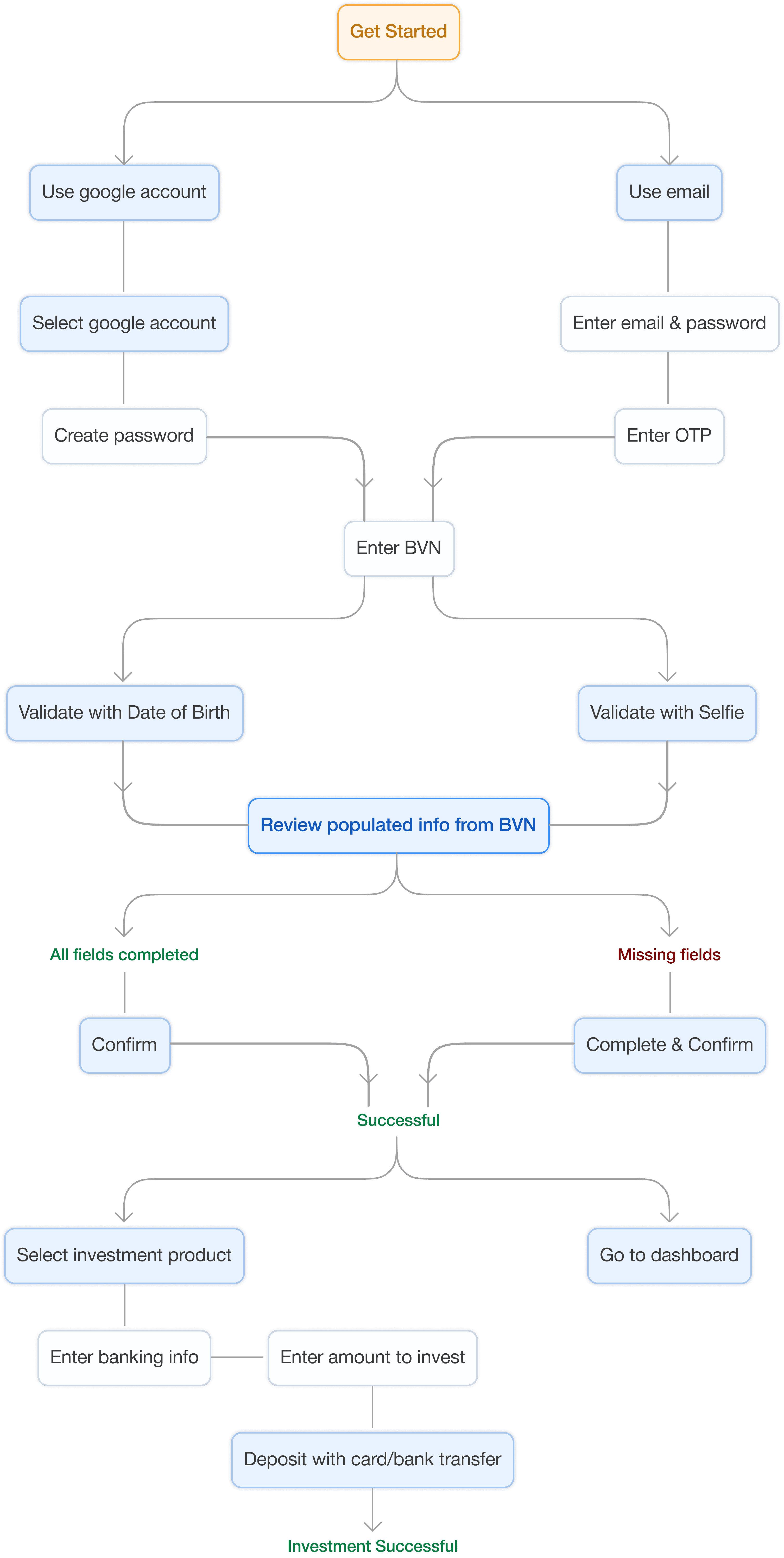
I rebuilt onboarding around a simple idea: let users in first, earn their trust second. Social signup with Google gets them through the door in seconds. BVN validation confirms their identity at a basic level. Then they go straight to the dashboard and can start investing immediately, before they even upgrade their account tier. Full KYC only shows up when it becomes relevant to what they want to do next.
I rebuilt onboarding around a simple idea: let users in first, earn their trust second. Social signup with Google gets them through the door in seconds. BVN validation confirms their identity at a basic level. Then they go straight to the dashboard and can start investing immediately, before they even upgrade their account tier. Full KYC only shows up when it becomes relevant to what they want to do next.
The result
The result
The time from signup to first investment dropped by over 60%. The drop-off that was bleeding the platform dry effectively disappeared.
The time from signup to first investment dropped by over 60%. The drop-off that was bleeding the platform dry effectively disappeared.
{4} Research & Audit
{4} Research & Audit
I mapped the entire onboarding flow and marked every moment a user was asked to give something before receiving anything back. The problem became obvious quickly. The app was treating compliance like a gate when it could have been a journey.
I mapped the entire onboarding flow and marked every moment a user was asked to give something before receiving anything back. The problem became obvious quickly. The app was treating compliance like a gate when it could have been a journey.
The key insight that changed everything is that SEC rules don't require collecting all user information upfront. They require collecting the right information at the right tier. That single realization unlocked the entire redesign.
The key insight that changed everything is that SEC rules don't require collecting all user information upfront. They require collecting the right information at the right tier. That single realization unlocked the entire redesign.